Monday, July 30, 2012

Sun and Moon

My newest painting was a joint effort between me and Michael. He came up with this awesome idea one night of having a painting that was made of four different rectangular canvases arranged in a "circle." At the center it would be daylight and on the outside it would be moonlight. 

I loved it! For some reason, while he was describing it I kept imagining a Gustav Klimt painting with vibrant colors and random patches of geometric shapes. While I didn't want it to look exactly like a Klimt painting, it was the geometry and the colors that I wanted, so I kept picturing squares like this:

 
I started with white, bright yellow, and orange and started making loose squares. As I moved out, I slowly added more oranges and reds, then purples, then blues, then greens, aquas, yellows, and whites again (but this time mixed with aqua). The trick was to take each color and just use a couple of brushstrokes to apply it. It ended up with a lot of texture and colors. I didn't want any of them to mix too much. 


 I really like the way it turned out! 

One of the best parts (that was Michael's idea) is that I can flip the canvases and have the moonlight in the middle instead:


I definitely still want to paint the sides black before I hang them, but I have to wait until they dry a little more first.

Check it out on Etsy

Thursday, July 5, 2012

New Abstract

I've finally finished this painting!!!


This painting was definitely a process. It started way back in February actually when Michael took me to Asheville, NC for my birthday. I've always had somewhat of an affinity for this city. Aside from the memories (dancing in Friday night drum circles during my "hippie phase" in college), it's an artsy city with excellent restaurants and lots to do. We decided to visit the River Arts District to explore a few artist studios. Right next to the coffee shop where we got our afternoon lattes was an artist named Jonas Gerard. 
Here is his website if you want to check him out: http://www.jonasgerard.com/

His painting are very colorful, vibrant, and active but the thing that really stood out to me was how in many of them he seemed to do a sort of wash with acrylic paint. I couldn't help but wonder what his process was. Did he mix the water and paint right on the canvas? Or did he mix water with his colors ahead of time? Did he have the canvas upright and let the water drip down the canvas? Or did he lay it on the ground Jackson Pollock style, pouring and dripping paint and water on the canvas, and moving the water around? 

I needed to experiment.

Unfortunately I have a very small apartment with only a desk as my studio space (as opposed to his 5,000 square feet) so I knew I would have to do this outside. This meant I was waiting till summer... I don't feel very "inspired" in the cold.

It took me a few hours, a nasty sunburn, and several trips back inside for more water, but this was the end 
result to my experimentation:

I liked it... but I didn't love it. I liked the wash parts - the areas on the right and left. I used a large paint brush, dumping water on the canvas, adding paint to certain areas, then dumping more water. It was pretty fun. Acrylic dries fast but I was able to move and tilt the canvas to move the color around and see what happened. I used a combination of moving the canvas, pouring water on the paint, and using my paintbrush to move the water.   

The part I didn't like was the middle. 


It was too much paint, not enough wash. The right and left of the painting were calm and flowing but this section just seemed angry. 

I didn't know what to do with it yet so I put it away for a while and moved on. It wasn't until I posted it on my facebook page, asking for input, that wise words from my friend Rachael Shansky helped me figure out where I wanted to go next. She said it reminded her of a hot summer by the ocean and I thought, "yes." It does look like the ocean! How did I not see that before??? Either way, I knew that I wanted the whole thing to have a peaceful, flowing feel... like the ocean. 

I didn't change the right and left canvas very much because they already had the feeling I wanted. 


 The middle section I completely changed. But I think it flows much better. What do you think?


My finished product:


Buy it here: 

Saturday, June 30, 2012

Collage Art... part 2


It's been a busy week and a half for me but I've finally finished stage 4 of my collage project! After putting together my collage, I left my sister's house in North Carolina... and left my collage there too. Fortunately she mailed it to me, along with a half dozen other things I left behind... and I was able to finish it yesterday. 

I'm finally able to paint again, but I'm determined to finish the project I started.

For the next step, I made black and white copies of my colored collage. I have access to a pretty nice copy machine so I may have gone a little overboard with making copies. I wanted to see what it would look like with varying degrees of darkness/lightness so I made four copies of each variation. This way I could practice, mess up, and try different color combinations if I wanted to.


 There were 7 different variations so I numbered the back of each copy to keep them organized.


 I chose to use number 6 for my collage. I was going to be coloring over the image with colored pencil so I wanted it to be dark enough that I could see the black and white shading through the colored pencil. 

Here is the difference between the #6 that I chose and a #1:


After deciding to use #6, I used the lighter copies to practice colors and different combinations. 


I don't often use colored pencils so all I had was this box of 12 colors. If you know how to blend colored pencils though, that's all you really need. If you are new to colored pencil art, the trick is to start off slow. Don't press too hard at first. Add light layers of color to mix them and then use the lighter color to blend them together. Most people don't know the amount of realism, color, and saturation you can achieve by properly blending with colored pencils. It's hard to explain so I recommend experimenting with some colored pencils of your own.

Try this: 
Take a dark color like blue or red and a light color like white or yellow. Apply a moderate amount of pressure and color a block of the dark color. Using the lighter color and pressing harder, color over your block. The trick is to press hard enough to get that waxy kind of surface, and not have any of of the texture of the paper making the white show through. You can use the light color to make the dark color look more solid and blend multiple colors together. 
 ...or...
Start out by pressing hard and covering a block with the light colored pencil. Use the dark color to lightly color over the section, then use the light color again to press hard and blend the dark color into the light color and make it solid.

For most of my collage I actually started out by coloring in sections with yellow first because I just wanted orange, red, blue, and green to be accents but I wanted everything to have a pretty bright undertone.


For this eye, I colored the yellow in really dark and then colored the oranges and reds on top of it. Then I used the yellow again to blend the orange so it wasn't streaky. 


Using colored pencils like this makes your piece look great, but it uses a lot of colored pencil...


 It takes a long time but it's worth it. 

Here is my finished product:


My next step will be to paint this. It looks okay now, but everything looks better when it's painted. I can fix things I don't like. This is just the basis of what I will be painting. 

Painting will take a while, so you'll have to wait to see the finished product. In the meantime, here is a sneak peak of what I'm working on right now: 


Monday, June 18, 2012

Collage Art

A week ago, I promised a post about how I made these two paintings: 


Life gets pretty busy when hanging out with a two year old... not to mention my mom and my sister. Unfortunately, this project has taken me slightly longer here than it would have at home... but I'm willing to trade art time for family time.

I have managed to squeeze in some artwork, although I am definitely excited to get home and paint again.
 I miss my paints...

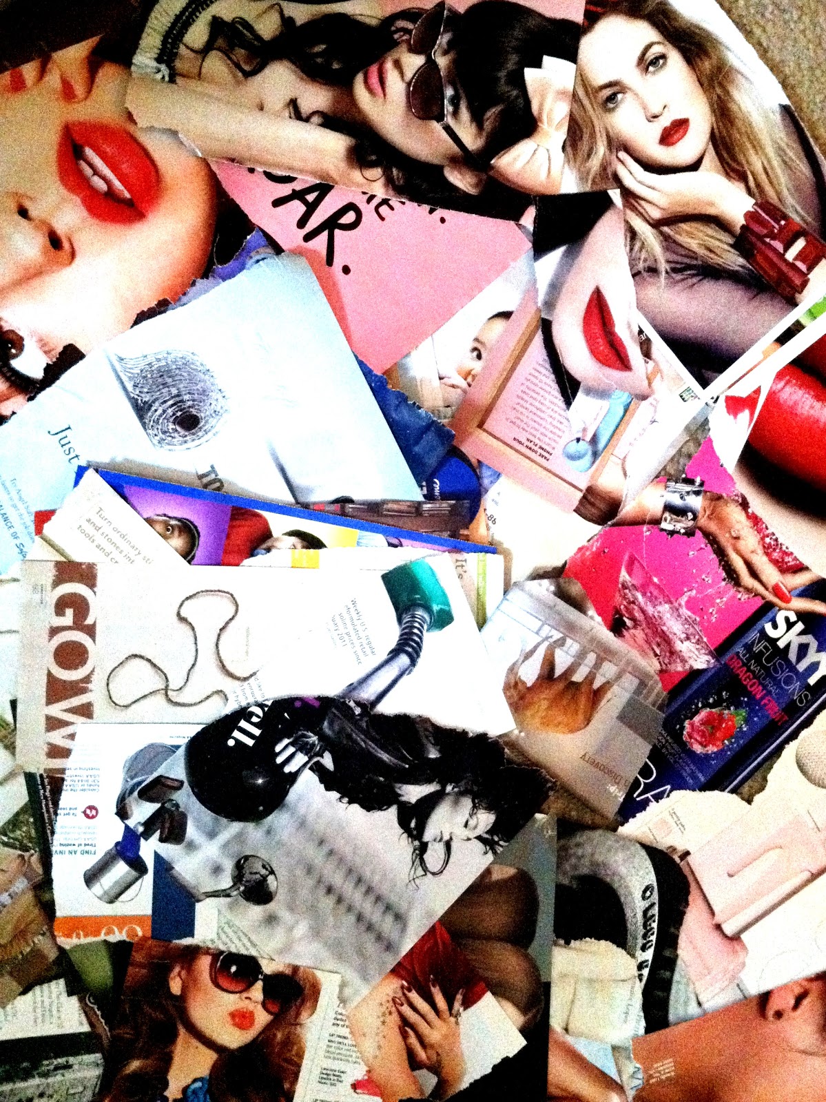
This project I can work on here, without paint and canvas. I start with a stack of magazines.

 
 Any kind will do, as long as there are pictures! I'm looking for any picture that catches my eye. 
Unfortunately the kind of magazines that work best for this kind of project tend to be fashion magazines. Fortunately, my sister had an old one lying around with all her magazines about kids and family.


Stage 1: Brainstorming
I flip through the magazines, looking for pictures that I think I can use in a collage. They have to be crisp and clear. I want it to be a striking image, but I don't skimp at this stage. If I can look at the picture, no matter what size, and think of a way to use it, I tear it out. Honestly, if it even makes me pause for a second, I tear it out. It's brainstorming and there are no bad ideas in brainstorming. As my husband always says, bad ideas lead to good ideas!

Stage 2: Picking a Theme
After tearing out every possible image I can use, I spread them out and look at them as a whole. I'm looking for a starting point. I'm especially looking for something that might inspire a theme or a story for my collage.  

In this case, it was a word: "GO"


 Once I had my starting point, I tried to let my instincts decide what images might add to the composition or theme. I started to take out any striking image that made me think, "GO." These images included clocks, legs, animals, kids, books, vacation spots, kids, water falling, a roller coaster, money, etc. I was looking for things that made me think of getting away from the real world or being active. 

 This image made me think, "GO" and it was very aesthetically striking. 


I also liked the way the torn edge looked and decided to leave that in my collage in some way, rather than using scissors to clean it up.

This picture isn't a great quality but here are some of the other images that made me think "GO"


 Stage 3: Making the Collage
I started this stage by cleaning up my images and cutting out the figures so I can look at the images the way they will look if I put them in the collage. When I say figure, I'm talking about "figure and ground" or positive and negative shapes. In any piece of artwork, I have to think about the positive space I'm making (or cutting out) and the negative space that is created by drawing (or cutting out) the positive shape (or figure).


 The most important thing I can stress at this stage is that I never cut unless I know I don't want to use the area I'm cutting out in my collage. 

For example, this image is so striking. I was tempted to try to cut out the whole thing, water included, but I didn't know exactly how I was going to use it.

 
Until I saw the clock. 


And I knew I could do this.


Using the larger images that stuck out to me, I started putting them together, thinking about lines, composition, and positive/negative shapes. 

The trick is to never be afraid to start over, move images, or rework the composition. I try to never get stuck because I'm afraid it might not look as good in the end. I have to trust myself - if I feel the urge to try something else then my collage probably doesn't look as good as it could.

When I started the collage, I didn't have the eye at the center. Everything looked okay but there was no focal point. I found this picture and thought it was perfect because of how the eye looks up. 


Having the eye in the center drew my attention first to the center, then up, which allowed the lines I created with the rest of my images to draw my eye around the composition. 


This collage looked good, but not great. It's just too busy. I have too many small images that either don't serve a purpose or detract from the lines I've created. 


Almost there but I need cleaner lines.


I like this. The bookcase is a good way of detracting from the stark edge of the "GO" but I think it should cover more space. I like the watch but I already have a clock so it's not necessary. The curved line of roller coaster in the middle on the far left looks good but it doesn't cover up enough space. 


Perfect. Now I just have to trim the edges. 


 My goal in putting together a collage is to create a striking composition by using lines and images intelligently. I want each line or image to draw my eye around my composition. 


I look from the eye to the hand/clock. The fingers of the hand/clock draw my eye to the black and white figure. I follow the line of her face to the legs. The line of the legs brings my eye down and around along the line of the roller coaster to the other legs. These lines I follow down to the star tattoo and hand which points back to the eye again. The goal of my composition was to create visual movement. I wanted the whole collage to be active, just like the word that inspired it. 

As you can see if you compare this to the previous photos, there are a lot of good images that I left out. One of the hard parts of creating the collage was to decide which images would work and which wouldn't. It's hard to leave out a really nice picture but if it doesn't add to the composition, it just makes it look busy. 

Having a lot of larger images that fit together like a puzzle looked better than having a lot of smaller images that seemed to float in space. I need the pictures to look natural in and among each other, not like I glued them on (even though I did).  

My first three stages are complete. While painting the collage as is would look cool and probably be a good piece of art, I have bigger plans for it. This post is getting a little long though and I need some more supplies in order to complete stage four. 

I'd like to tell you that my post on stage four will take me less than a week to complete this time, but my little nephew could still come any day now! As long as my sister doesn't go into labor in the next few days I'll show you my process for stage four soon!


Tuesday, June 12, 2012

Talking About Art

One of the hardest parts of teaching art is trying to get my students to talk about their artwork. There is something deeply personal about being the creator of something. I think it is a fraction of the sentiment that parents must feel when they look at their children. I also think that is why parting with my artwork can be so hard. Each painting contains a part of me, and it is both rewarding and difficult to let them go.

Because each idea, color choice, and brushstroke is a deliberate decision made by me, it's hard to talk about what all of these choices mean and why I made them. Sometimes a choice just feels right, and sometimes it has a specific purpose.

I'm going to use this blog in an attempt to tell you about my artistic choices and the ideas behind them. I say attempt because it's going to be a difficult task, but I'm excited to try.

I'll try explain what inspires the ideas for my pieces and the process I go through to make each one. I'll keep you up to date on any new projects I'm working on and what I hope to accomplish with them. I'm also going to throw in some posts that describe pieces I've already made or sold and how I went about making them. In fact that is what my first few posts will be!

I'm staying in North Carolina right now with my sister, waiting for my baby nephew to join the world. I'm away from my studio for the time being (which, of course, means my brain is overloaded with new ideas!) so I'm focusing on my preexisting artwork.

I recently created a Facebook fan page to display my art and keep everyone updated on my work. I chose one of my favorite paintings for my cover page:


I did this piece so long ago that I had almost forgotten about it until I was loading my artwork into albums for my Facebook page. I love the way I made this painting - and the "self-portrait" I created in the same way:


In fact, I love my process so much, I've decided to do it again! Luckily, this process is one I can start here, away from my studio, and you get to be a part of it!

Stay tuned for my next post so you can see what I'm working on!